The reference “above the fold” might not be familiar to everyone, but it relates to the content that is first seen when a web page loads without scrolling down. This concept originated from newspapers. They were displayed within a news box vending machine – with the newspaper being folded in half and only its top part being visible. In today’s digital world, the concept is applied the same way, but for websites.
A question was brought to Google’s Senior Webmaster Trends Analyst, John Mueller, about whether Google gives more preference to content above the fold or below the fold. It is believed that the more content there is above the fold, the better the user experience will be. And better user experience leads to better search engine ranking.
A lot of research has suggested that keywords and headings near the top were considered more important by Google’s algorithm than content at the end of the page. However, that was the case before Google began utilizing Artificial Intelligence (AI) and natural language processing to better understand the content. Today, Google can understand the content on the top, middle, and bottom of the page, so it ranks pages based on the 3 categories.
John Mueller also confirmed that they don’t have strong preferences in regards to content positioning. He added that content above the fold is still essential, and it should be available for users to see a part of your page. For example, if a user goes to the Home page and the first thing they see is a big, wide image of a restaurant, they won’t enjoy having to scroll through the site just to find some information, and neither will Google. However, it is much better if they go on the Home page and they see an image in the corner, plus some valuable information, for example, the menu, an option to find the nearest venue, an option to book straight away, etc.
The following examples perfectly illustrate the usefulness of having an optimized “above the fold” section. Moreover, even scrolling down, it can be seen that Prezzo is much more user-friendly than Figo.
What are some of the best “above the fold” strategies to hook potential buyers?
- The moment your customer enters your site, they should see the latest, most accurate offer you have. It’s important to have that crystal clear to avoid disappointments.
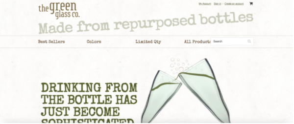
- You should concisely explain what differentiates you from other companies and why customers should care. Here is an example of a company that sells recycled glassware created from wine and beer bottles – pretty unique, right?

- Simple, clear navigation bar, which leads to everything important about your brand.
- Compelling images that are placed alongside valuable text.
- Going back to differentiating yourself, customers should also know straight away the benefit of purchasing from YOU and not from your competitor. For example, Prezzo instantly allows people to check where the nearest venue is, and if the distance is satisfactory, they are very likely to visit and dine at Prezzo.
- A well-placed CTA gives a chance for customers to go straight to doing what you want them to – to “Shop Now”; “Find out more”; “Sign up today,” or something else.
- Brand Logo might be the most self-explanatory and obvious element in the above the fold section. However, pay attention to how much space it is taking up on your page and where it is placed. The most natural positioning for a logo is in the top left-hand corner.
With the correct elements, above the fold content can provide a smooth, enjoyable experience for users. And everything good for users is good for Google and good for your website’s ranking!
In case you’ve missed it, check out the following articles to see how you can improve your SEO practices: what is important for SEO; how to write user – personalized content, and 5 reasons why Google isn’t indexing your page. Sign up for our newsletter to make sure you never miss any valuable content!

