When it comes to making your website look professional and appealing, there is no better way than including high-quality images. There are many factors that play into what makes images look good on a website, for instance how they load and if they’re sized properly.
Google Search Central recently released a video with Alan Kent that talked about 6 tips to help with image optimization. Here, we will lay them out so your website or eCommerce page can be sparkling.
If you want to keep up with Google news, or simply need a translater for what all that computer jargon means, make sure to subscribe to our weekly newsletter so you never miss an update.
Which Images are we talking about?
Well, all of them. As Kent says in the video, “It is not uncommon for an eCommerce page to reference hundreds of images.” Hundreds of images means you need a lot of optimization to look smooth on the page.
Some of the images that are included in this tip guide include full-sized product images, smaller product thumbnails, category images, banners, page decorations, button icons, etc.
Efficiency is everything when it comes to keeping consumers engaged and making sure they don’t leave your website while too many images try to load all at the same time. No fear, these 6 tips address exactly that.
Tip #1: Eliminate image Cumulative Layout Shift
This first tip has a lot of moving parts on Google’s end and requires a few definitions to fully understand what is really going on.
Firstly, what is Cumulative Layout Shift (CLS)? CLS is simply when the page visibly moves around on your screen. Think about when you’re on a website on your phone and you try to click the link and suddenly the page moves. CLS does not create a good user experience, and loading images incorrectly can have an effect on that.
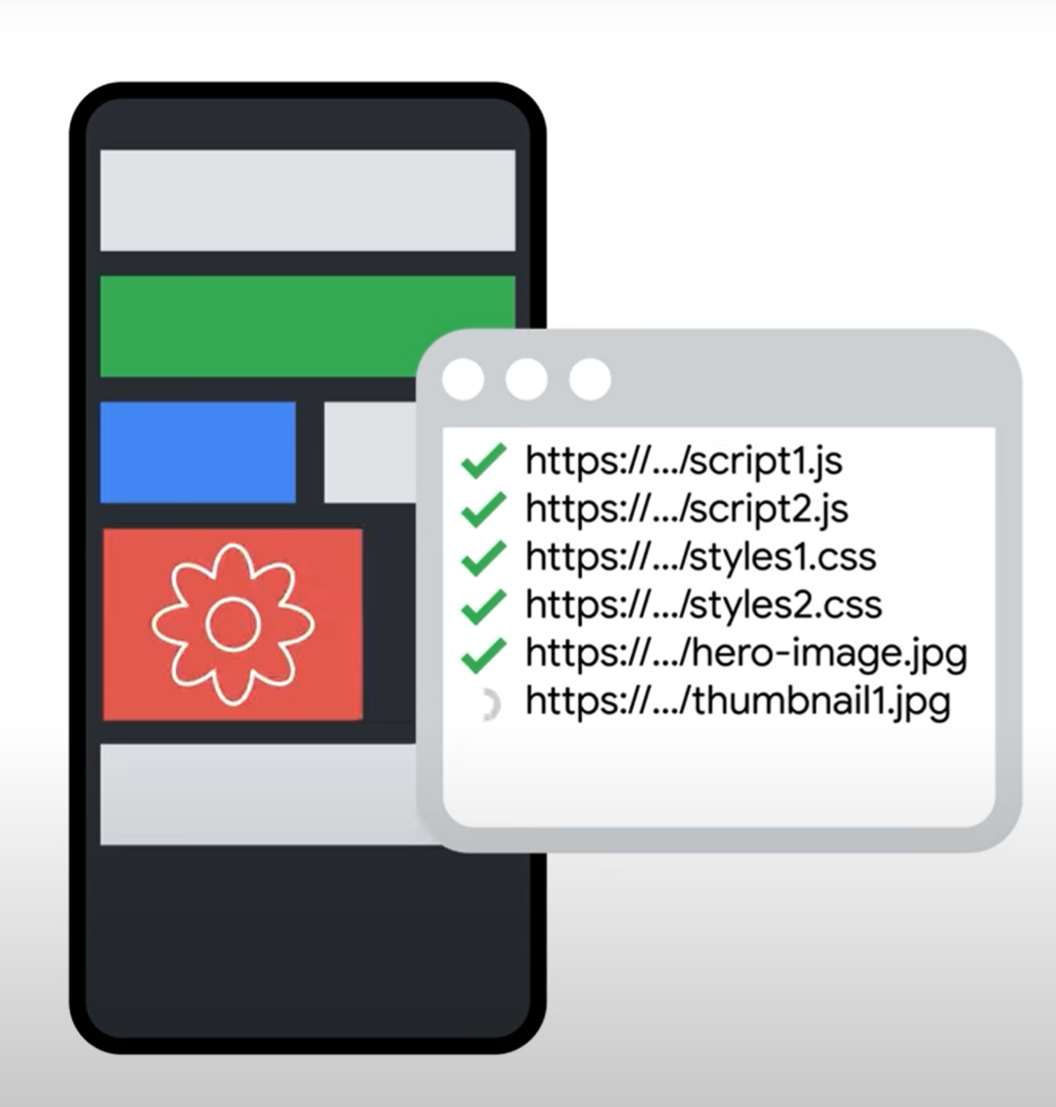
So why are images sabotaging your CLS? When a web page is loading, your browser will start to download the HTML markup of the page. With most browsers, the top of the page will begin displaying before the entire page has been downloaded.


Source: https://www.youtube.com/watch?v=RQH9IpcAucY
To reduce a user’s wait time, any images that the browser encounters in the code are added to a queue of resources to download. These files are then downloaded in parallel to the main page a few at a time.
The problem arises when the browser does not know the image dimensions before rendering the page content. CLS occurs when the browser did not leave the correct amount of room on the page for that image, making a cascading effect as it corrects itself after loading the page.
It is easy to spot the error when you are watching it manually. Or, you can use the Chrome User Experience Report, or CrUX, to measure this for you using the PageSpeed Insights tool. Fixing the issue can be as easy as including image dimensions in the HTML markup, which we will discuss in the next tip.
Tip #2: Correctly Size Your Images
The problem associated with this tip is that larger files take longer to download, and larger files require more time to process. People who are in areas with slower network connections or people looking at your site on mobile devices may not have the same quality of service if images do not get correctly sized.

There are complications when it comes to sizing your images correctly. Depending on which device you are on, the images could be either cut off or sized down. Seizing control over this process is crucial to overcoming this problem.
Kent advises in the video that one way to easily detect incorrectly sized images is using the “Properly sized images” section under “Opportunities” in the PageSpeed Insights report. Pagespeed Insight identifies images on a page that have larger dimensions than needed.
The good news is that once you find the problem, it’s an easy fix. As seen in the image below, there is some pretty simple HTML code that will resize your images for you to whatever dimensions you put in. This is better than letting the computer decide how big the file is, or using the original file you uploaded that turned out to be incorrect.

Source: https://www.youtube.com/watch?v=RQH9IpcAucY
Finally, if resizing your images is confusing or too much work, there are ways to automate the process. Consider using a Content Delivery Network (CDM). These services resize your images to convert them into more efficient sizes and formats on your behalf.
Tip #3: Compress Images Appropriately
Hand in hand with the previous tip, compressing your images correctly can be the difference between a shopper choosing your product or moving on.
As before, Google directs you to their PageSpeed Insights, but this time under the “Encode Images Efficiently” section. This report can be used to find images that could be compressed more optimally, as well as identifying which image sizes could be better (see, Tip #2).
Kent does warn, however, that this report is only based on commonly used compression factors and does not run a visual check.

Source: https://squoosh.app/
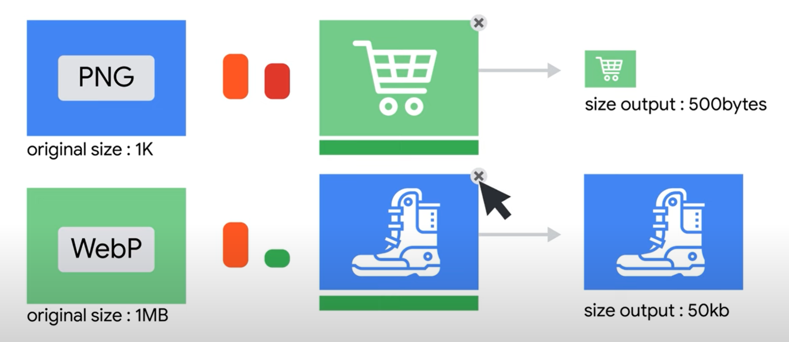
To find a good conversion for your compression, Google recommends trying out different conversion quality values using your favorite conversion tool. They forward their viewers to the Squoosh.app site to help with seeing the before and after of different conversions.
Tip #4: Use the best image file format
The next important step to optimizing your images is choosing the correct file format. Popular formats include PNG, JPEG, and WebP files. The format of the file will ultimately affect the file size, and there are tradeoffs between them. For instance, JPEG and WebP files are significantly reduced in quality when they are reduced in file size or made smaller on the screen.
However, sometimes taking the lower quality option is actually more beneficial than the higher quality version. This is true when pixel-perfect images are required, such as for button icons. Most of the time the quality difference won’t be noticeable by shoppers, but the speed benefit will be substantial.

Source: https://www.youtube.com/watch?v=RQH9IpcAucY
To know if your website could use a better image format, once again Google directs you to their PageSpeed Insights report, this time in the “NextGen Format” section. This part of the report will let you know which image files could be converted for better efficiency.
So should you be only using one file format for the entirety of your website? Well, not all file formats will be supported on every browser. Check out caniuse.com to see which file formats are suitable for certain browsers. Google recommends WebP for a good balance of efficiency and quality.
Finally, just as in tip #2, CDMs can help solve this problem. Along with image sizing, they will also choose to have your website return the most efficient format that the browser says it supports.
Tip #5: Cache Images in the Browser
The fifth tip is to tell the browser how long it can cache an image. In this example, Google recommends doing this for images that are going to be mostly permanent residences on your website. For instance, something that could reasonably stay on your page for 3 years, or as they call it in the computer world, forever.
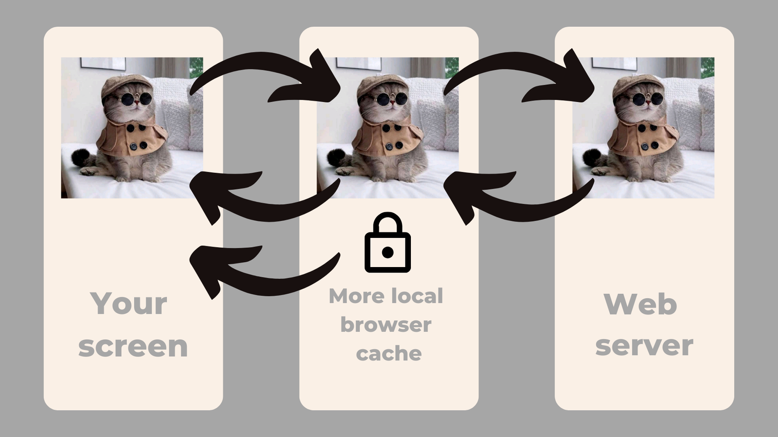
As we discussed in previous tips, images are larger files that can take longer to load. When a user visits your website, the browser will go through a series of more local caches until it reaches the closest web server to retrieve your site. From here in Northern Virginia, that means your data may be coming from as far as New York or even Chicago.

When you include an HTTP response header with caching guidance, essentially you are telling the browser to keep your image in the more local cache sites so the computer does not have to reach so far to find your image. Therefore, the images on your website will load faster since the browser doesn’t have to go as far to reach where your data is stored.
So how do you correctly add an HTTP response header that is going to work for your website? Google once again directs you to the PageSpeed Insights report, under the “Serve Static Assets With an Efficient Cache Policy” section. This will let you know what images could benefit from this caching system.
There are two other ways to cache your images. The first is under the “developer tools” inside Chome. Chrome will allow you to see the HTTP response headers and change the web server settings. Secondly, using a CDN will make downloads faster by caching copies of your images in multiple locations around the world.
Tip #6: Correctly sequence your image downloads
This tip begins with a disclaimer from Kent that this was a more advanced tip. No fear, we will walk you through this so it is easy to understand and totally doable. Correctly sequencing your downloads can greatly improve the user experience.
In what order should the images on your website load?
- Hero images above the fold
- Other images above the fold
- Images below the fold
- Lazy load the rest
Let’s break this down. Hero images are large images, like banners, that contain a lot of great content on your page and take up a large portion at the top. You will want those to load first no matter what.
The fold, in web design, refers to the content that loads before the user scrolls. Make sure to prioritize those images first. To discover the fold on your website, make sure to look on computer, mobile, and tablet to find exactly where that lies.
Finally, lazy loading is when your website only fetches what is needed as the user scrolls. Make sure that when you implement lazy loading on your website to only choose images below the fold. Most browsers support the loading=lazy attribute in HTML, which may be the easiest way for you to implement it.
To know if your images are loading correctly, use – you guessed it – the PageSpeed Insights report. The “Defer Offscreen Images” will help you will sequencing which images should be displayed in a certain order. Another section that Kent recommends is “Avoid Chaining Critical Resources,” which may lead you to your JavaScript or CSS files.
Conclusion
Optimizing your images can be as simple as including image tags in their HTML to resize them, or as complicated as manually including which images should load in which order. It’s up to you to choose the best solutions based on your skillset and website needs.
While Google obviously was directing their audience to use the Chrome features, these features can be found on about every popular browser these days, including Firefox and Safari.
What is important here is that your download speeds are as efficient as they can be for every user, so you never lose a customer because your images won’t show up fast enough.

